Don't know the difference between a Venn and a Carroll Diagram? Don't know how to use one? Find that using Spreadsheet programs to be a lesson in everything but Graphs and interpretation? Spreadsheet Programs can be complex and distracting with too many features.... Teaching graphs is a simple introduction to basic graphs and interpretation of data.
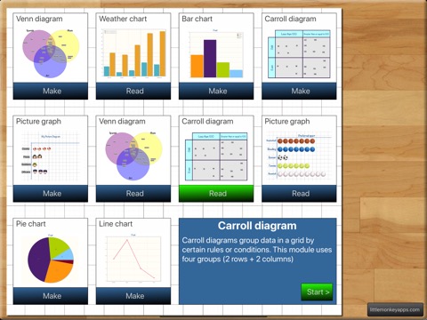
Teaching graphs includes two types of activities, 'Read' and 'Make' including picture graphs, Venn & Carroll diagrams, bar, pie and line charts.
Students are asked to read and interpret data from four types of graphs, coming to recognise the features and purposes of each graph type. Students are also able to collect their own data and create their own graphs (4 different types of graphs) They can set labels, colours and adding values.
Students can email a graph or save the graph to photo gallery.
READ GRAPHS
There are four types of graphs that have various questions asked.
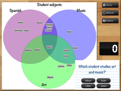
=Venn diagram=
The most overused type of diagram in early years education! Little Johnny likes apples and pears, but Sara likes apples and bananas! Although we have included that type of question in the App, this is just the beginning of what a Venn diagram is REALLY used for. Once students have the basics, a Venn diagram can also be used to show more complex ideas in a visual and logical manner, helping children to make links between the similarities and differences of a particular set one example is comparing sets (or traits) such as motorbikes vs bicycles.
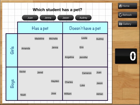
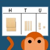
=Carroll diagram=
A Carroll diagram is used to sort information in a 'Yes / No' manner . This type of diagram aids students to organise information in a systematic manner. In the App, we have used two attributes (a 2 x 2 grid).
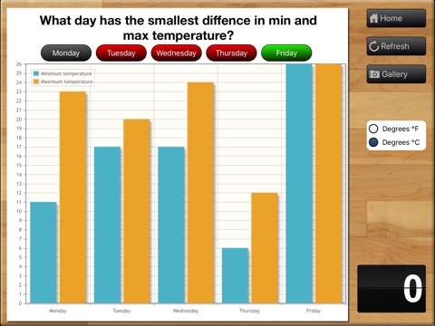
=Weather graph (bar chart)=
This module creates a minimum and maximum bar chart for the next five days of weather in your location. You can switch between Fahrenheit and Celsius. The module asks recall questions about the weather, I.e. 'What is the hottest day?'
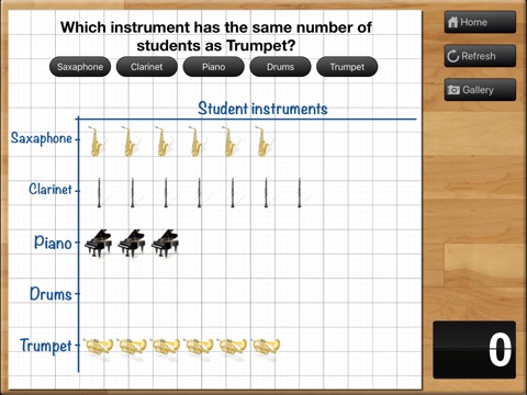
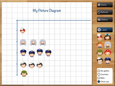
=Picture graph=
Picture graphs are often the first introduction to graphing. It is important to note that the pictures are the SAME size and spaced evenly. Instead of traditional bar shapes each value is incremented using pictures. We've included marbles, sports balls, musical instruments and student dress-ups.
MAKE GRAPHS
There are 4 types of graphs that can be created. Students can email or save graphs to the photo gallery which allows record keeping for later instruction or comparison between appropriate graph types for a particular purpose. (You probably wouldn't use a venn diagram to show temperature across a week, a bar or line graph is more suited...but what a good teaching point.)
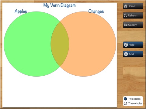
=Venn diagram=
Create a Venn diagram with 2 or 3 intersecting circles. Students can label each circle and set the colour. Items can be added and dragged in to place.
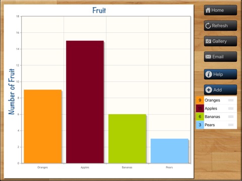
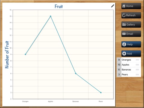
=Line/bar graph maker=
Create a single series bar or line graph. Switch between the two types of graph depending on the type of data. The line colour and bar colour can be set and items can be labelled. Line graphs are more appropriate for accumulative data sets such as temperature over one day whereas bar graphs can be used for temperature across a week.
=Carroll diagram=
A 2 row by 2 column Carroll diagram can be created. Labels and items can be customised.
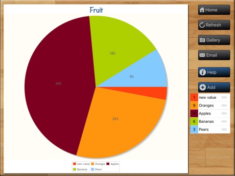
=Pie chart maker=
Pie chart creation can be difficult without the assistance of IT devices as young children aren't able to understand the mathematics behind its creation (angles, using a protractor,) Students are able to create their pie chart by inputting data sets, change the colour and value for each slice. Great introduction to percentages for more advanced students..work backwards and complete the task on the App and (oh my goodness, yes, I'll say it...) by HAND!